
The landing page continues the ad’s promise. A person who clicks an ad about booking a consultation should not need to search a generic homepage to find the booking flow. Review the ad and destination together as one customer experience.
Continue the same conversation
Repeat the substance of the offer in the page heading and opening explanation. Use the buyer’s problem to determine what comes next: a product demonstration, service scope, pricing context, comparison, or application process.
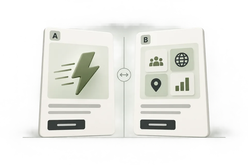
For a small agency evaluating reporting software, show what a report contains and who it is for. A page full of unrelated capabilities may be accurate but still fail to answer the question that produced the click.
Give the visitor enough evidence to decide
Use actual product screenshots, clear examples, supported claims, and a specific description of the next step. Label sample data. Explain important prerequisites such as advertiser access or a required integration near the relevant action.
Avoid invented testimonials, unverified performance multipliers, or urgency that has no factual basis. These can create a gap between the ad’s promise and the experience a buyer receives after signing up. Clear limitations often prevent unsuitable leads and unnecessary sales calls.
Reduce friction in the primary action
Check that the form or checkout works on a small screen, with the expected keyboard and validation messages. Ask only for information needed at that stage. Explain whether submitting a form books a meeting, requests contact, or starts an account.
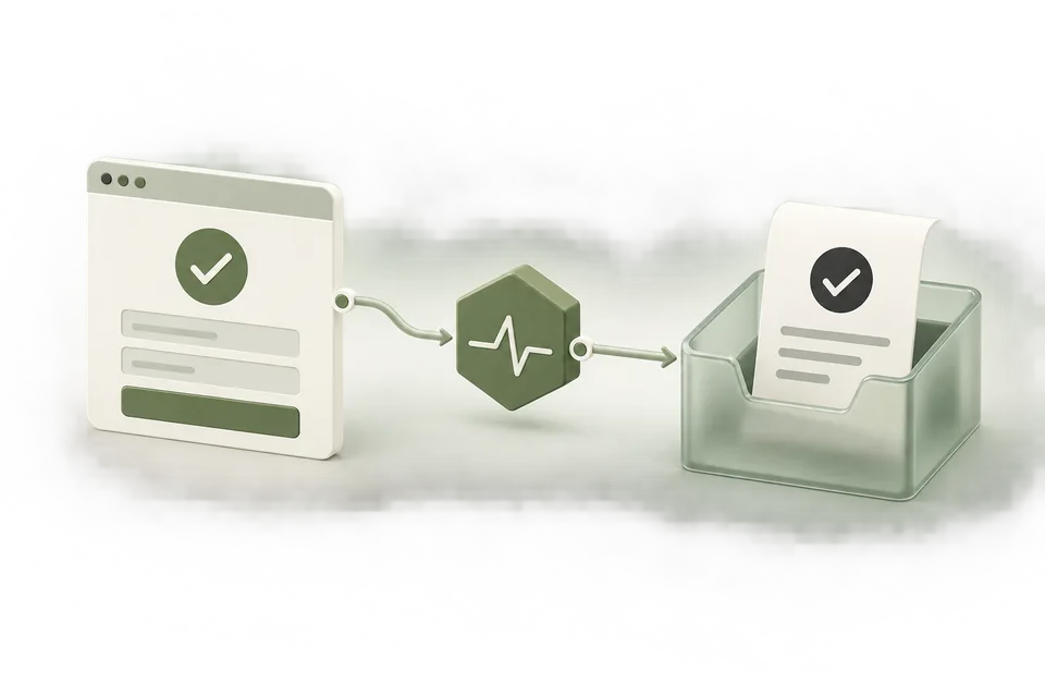
Test errors as well as success. A failed payment or invalid form should not fire a completed-action conversion. A successful action should give the visitor an unambiguous confirmation and create a durable business record.
Preserve the measurement path
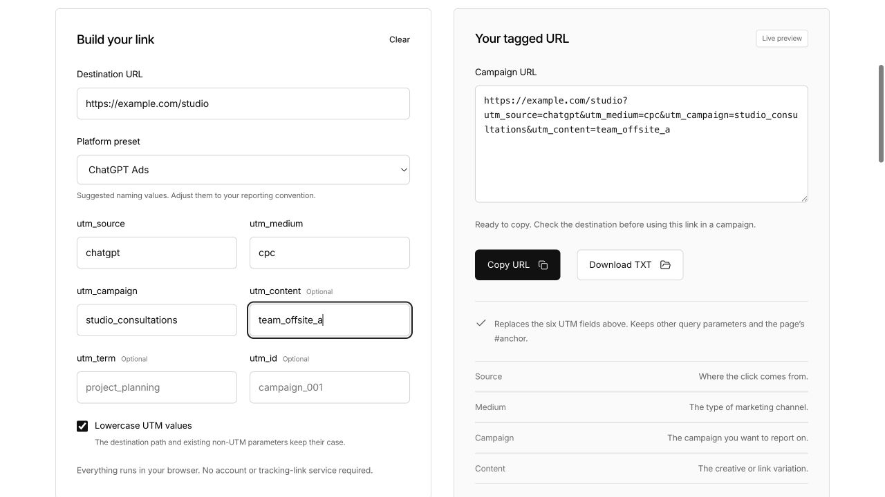
Generate the campaign URL, open it through the actual redirect chain, and verify the final destination. Keep tags consistent across creative variants. If a booking or checkout moves to another domain, document how your analytics and conversion implementation handle that transition.
Use stable event IDs for completed actions and inspect the browser and server paths separately. The landing page is not ready merely because the pixel script loads; the successful business action must be measured correctly.
Review technical usability in context
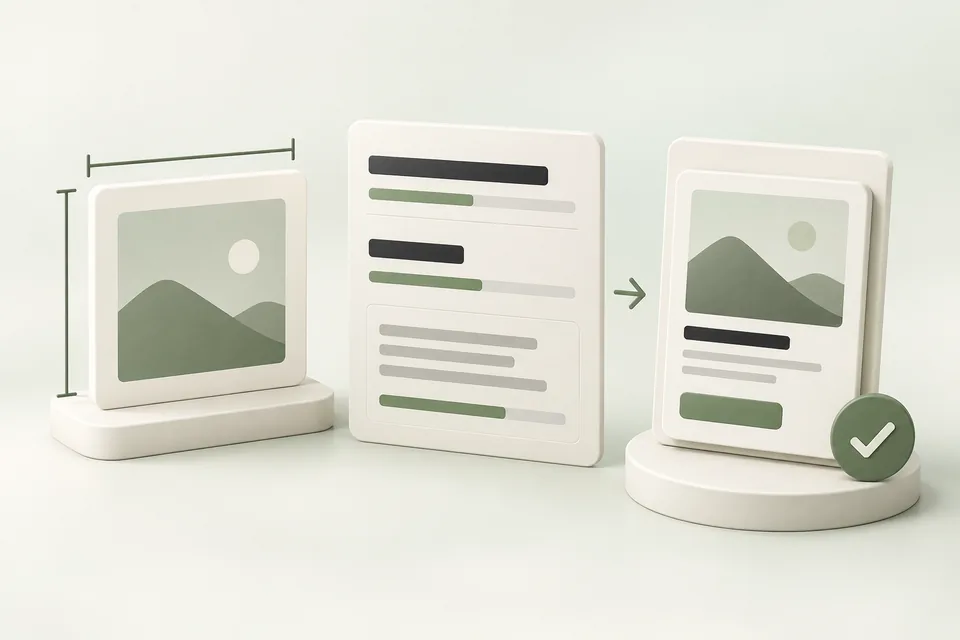
Check the page on a typical mobile connection and inspect whether the heading, main image, and action are usable before everything else finishes loading. Reserve space for images so the action does not move unexpectedly. Use descriptive labels and readable contrast.
After launch, compare page observations with business outcomes. A high number of arrivals and few completed actions may indicate an offer mismatch, friction, poor traffic fit, or measurement failure. Diagnose before redesigning the entire page.
Sources and verification
Platform details checked on September 11, 2026. Your account may expose a different set of features. Examples are illustrative unless a dataset is explicitly supplied.